
Ashley Edwards home as featured in Domino, is like the Mary Poppins of homes to me - 'practically perfect in every way'. It's remained a favourite of mine since I first laid eyes on it, and keep coming back to it for inspiration. It really strikes a cord with me with its slick black and white scheme throughout the whole home, with pops of bright colour brought in through little accents and lots and lots of art.

There's a lovely sense of playfulness, vintage pieces mixed with sleek modern and pop art. It really feels like a space that was fun to put together and that is meant to be lived in and enjoyed.


Basic white modular office pieces pop against the slate grey walls and puts the focus on a wall full of inspiration and colour. The vintage chair upholstered in black and white stripes and accessorized with a yellow pom pom pillow adds a touch of whimsy to a space that's more work than play.

Throughout the home, Ashley has used touches of natural elements - jute rugs, woven baskets and stools. It really tones the strong black and white scheme that can sometimes be a little too dramatic or harsh.

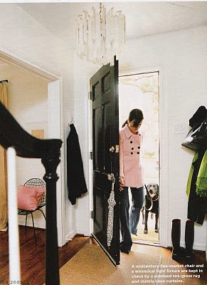
I love how all the doors were painted in a glossy black - adds a sophisticated touch, and the crystal doorknobs add a refined vintage feeling.

The bedroom is an elegant and tranquil retreat. A little more muted and subdued than the rest of the home and with less colour and art, but still consistent to the black and white theme. Seems like the perfect space to rest your head (and your mind) at the end of the day.
{Photos: Paul Costello for Domino magazine November 2005, via MA Belle}
6 comments:
100% my style- love this tour..black doors and crystal knobs make me soo happy!!
Love the combination...such a great home! Love it.
xxLily
goldandgray.com
That black gets me everytime, so rich and elegant, old world and chic. Love it!~
I love how clean and modern the space is yet very lived in. And she is just so stylish!
Great chandelier in images 1 and 3!!
Christine - I think that you and I are totally on the same wavelength!
EH - I think it's those old world details that make it really sophisticated while the more modern pieces keep it fresh.
DB - agreed, it still looks so comfortable and approachable, which to me is just so appealing!
SoM - me too, it reminds me of a vintage piece from the 60s/70s (maybe it is?)