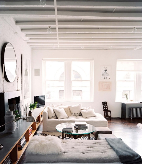
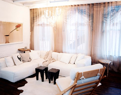
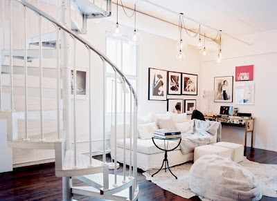
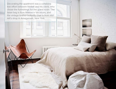
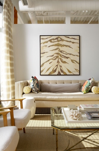
There's something so light and effortless about Jarlath Mellett's Manhattan loft. Bathed in all white and soft grey tones, it seems the perfect retreat from the city chaos. Very relaxed and unfussy, with a worldly well-travelled sophistication and subtle little hints of glamour throughout. There's a natural, earthy element which makes it feel very grounded. The space doesn't read as overly masculine or feminine, just a calm neutrality.
- Art
- Architecture
- House Tours
- Fashion
- Photography
- DIY Ideas
- Etsy Finds
- Travel
- Book reviews
- Toronto Guide
Pages
Showing newest 11 of 21 posts from 1/1/11 - 2/1/11. Show older posts
Showing newest 11 of 21 posts from 1/1/11 - 2/1/11. Show older posts
Monday, January 31, 2011
Friday, January 28, 2011
The art of furniture
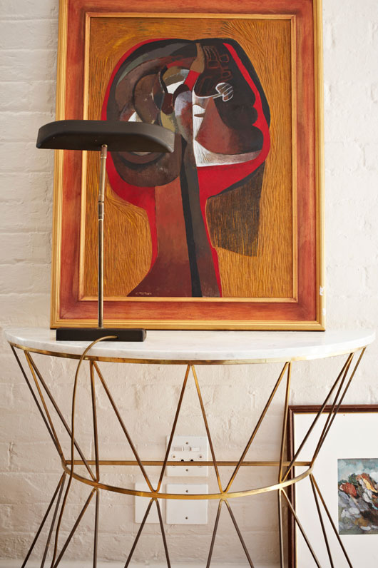
In a Cape Town loft filled with a very impressive collection of colourful art, one piece stood out to me, and it was actually a piece of furniture. Strikingly simple, yet very interestingly detailed, to easily complement the quietest or the busiest of spaces. I'm lusting after this beautiful console in gold and white marble, to me it is a piece of art all on its own.
|
Posted by escapade at 8:51 AM
Labels: art, Cape Town, carrera marble, elle decoration, gold, South Africa, table
Thursday, January 27, 2011
Pretty pieces in chevron
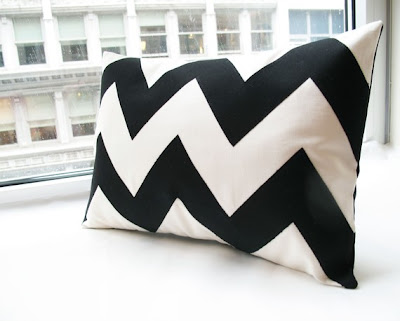
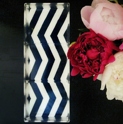
Nothing beats the dramatic impact of simple, bold stripes - chevron always has just that touch, with a twist! Here are some of my current favourite pieces in chevron - pillows by Honey Pie Designs, and lucite trays by Tilly Maison, both found on etsy.
|
Posted by escapade at 1:00 PM
Labels: black and white, chevron, etsy, fuschia, lucite, pillows, tray, turquoise
At home: Tommy Smythe
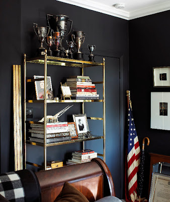
This space is a prime example of how to live large in a (very!) small space.Tommy's former apartment, (pictured here) was a mere 180 square feet, but you can see that he's spared no effort to cram as much fabulous into each square inch as possible! This tiny space has been transformed into a veritable gentleman's haven, reminiscent of a classic country club.
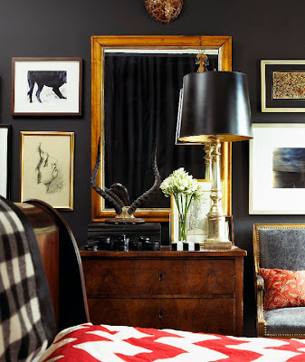
Tommy has definitely disspelled the notion that you can't use a dark colour in a small space. Here he's used Farrow and Ball's Off Black. His tip for dark colours? Rule No. 1 - Don't be afraid! And use the flattest possible (matte) paint.
The black walls show off the warm wood and gold accents so beautifully, and instantly add a sense of elegance and luxury.
Tommy has displayed his collection of ebony objects and a set of Springbok antlers on this beautiful antique dresser from the 1850s.
When the space is limited, everything has to be multi-functional. Here the nightstand doubles as a dining table set for dinner a deux.
'It isn't a home without books' - this vintage brass etagere has to be the most elegantly functional way to display a host of treasures.
{Photos: Michael Graydon via }
|
Posted by escapade at 8:46 AM
Labels: bedrooms, black and gold, chevron, farrow and ball, off black, small spaces, tommy smythe
Wednesday, January 26, 2011
Black, white, majestic
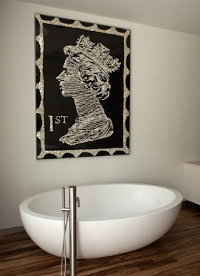
I first saw this beautiful piece quite some time ago while sharing the fresh and enormously creative work of one of my favourite firms - Sixx Design. My always stylish aunt, an avid art collector from whom I inherited my devotion to the classic simplicity of black and white, had written to ask me the source of this piece. Unfortunately, I wasn't able to give her an answer at the time, however, I was delighted to find it's source recently and so excited to find that the piece was even more spectacular than I'd realized. Created by UK artist Ann Carrington and inspired by a vintage postage stamp, the piece is crafted from several tiny pearlescent buttons sewn onto canvas. I thought the piece was fantastic even just painted, but the buttons add such an interesting texture to the piece.
The Novogratz have featured this piece in a few of their designs and the effect is always impactful. It really is one of those classic pieces that would look great in a variety of different spaces and applications - definitely worth the investment!
Ann's limited edition prints of this piece are available through her site here.
{Photos: 1,2 - Ann Carrington; 3,4 - Sixx Design - discovered at eyeseepretty}
|
Posted by escapade at 1:15 PM
Labels: ann carrington, art, buttons, queen elizabeth, Sixx Design, stamp
Sunday, January 23, 2011
Wanderlust: Post Card Inn, St Pete Beach, Florida
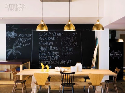
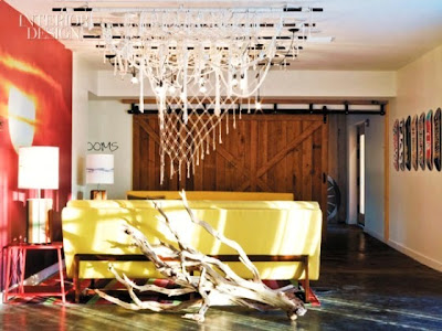
This weekend in particular, I'm longing to flee the oppressive cold and head south to sunny skies. I have some very special memories at the time of year in Florida, and while Miami will always be a favourite, I loved the relaxed, laid back atmosphere of The Postcard Inn in St Pete Beach, Florida. The Postcard Inn really is the epitome of laid-back cool - with a fun 1950's surfer theme, it's quirky, retro styling and relaxed, casual atmosphere make it a hip bohemian retreat.
This built-in book shelf really doubles as an art installation. I love how cleverly they've style it into pockets of colour, yet it still feels approachable enough for you to want to grab something from one of the shelves.
True to its name, many rooms feature a plethora of bright postcards, as well as surf photography by local artists, and clever quotes from sources ranging from Thoreau and Warhol to Jay-Z.
The Moroccan lanterns are a fun and unexpected burst of colour above.
{Photos: Eric Laignel for Interior Design}
|
Posted by escapade at 10:00 AM
Labels: florida, hotels, post card inn, st pete beach, wanderlust
Friday, January 21, 2011
At home: Sabrina Linn
Designer Sabrina Linn transformed her urban, industrial loft space into a warm and luxurious haven through a rich blend of pattern, texture and traditionally styled, elegant furniture that is a little unexpected in this type of building. Using warm tones - orange, copper and gold accents throughout, the space exudes a warmth that contrasts so beautifully with the soaring high ceilings and open, airy windows. While the space isn't huge, the open layout and traditional gold details make it feel quite luxurious.
Aside from an affinity for the colour orange, there are many elements of the space that remind me of Jonathan Adler - a mutual love for the hold and glamour of decades past and the bold, graphic patterns of David Hicks. I think these two would have loads of fun shopping (and decorating) together!
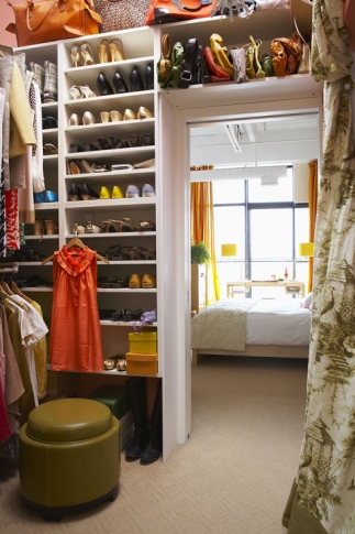
Every girl's dream - a walk in closet with a place for everything and everything in place.
Quite fitting for a stylist, the space seems to be bursting with with patterns and swatches. This board filled with images, swatches even flowers seems to be a veritable goldmine of inspiration.
{Photos: Sabrina Linn}
|
Posted by escapade at 2:25 PM
Labels: closets, designers, inspiration board, loft, orange, penthouse, sabrina linn, stylists
What's in your handbag? {Sabrina Linn}
Rather than describe herself on her website, stylist and designer Sabrina Linn knew that often objects can speak louder than words, in this case, all the little commodities she carries so close to her. Of course, my nosey side was all too delighted.
Here's the rundown on what you'll find inside Sabrina's handbag:
The bag: a great leather bag, big enough for all of life's necessities but still chic enough to schlepp around town
Notepads + Daytimer: So old school what can I say? In bright pink and ready to take down notes with a felt pen. Best yet: they never run out of batteries!
Swatches: be it fabric or paint for the next time. Keep them around because you never know when you're going to find their perfect match.
Modern technology: music to provide a soundtrack and snaps to make it all more memorable.
Thank you cards: - be a little Doris Day - a handwritten note goes a long way in this day of email. Best to keep them on hand so that you can write them before you forget.
Identity: whether crossing the border or circulating at a cocktail party, always be ready to have proof of who you really are
Inspiration: - magazines or books - in this case the ultimate style icon himself David Hicks. Sure it's heavy but you never know when you need a little style hit to get you going (or something hard to write on!)
{Photos/text: Angus Fergusson for Sabrina Linn}
|
Posted by escapade at 9:17 AM
Labels: designers, handbag, sabrina linn, stylists, Toronto
Thursday, January 20, 2011
Modern contrast
I love the dynamic constrasts in the Madrid apartment of interior stylist Maria Muro. Classic architecture with modern furniture. All white with bright colours. Straight clean lines mixed with curves. Antiques mixed with modern pieces in lucite. There are so many interesting things happening in each corner of the space. It feels comfortable and lived in, not overworked.
The navy wall really shows off the warm wood of this antique dresser beautifully, and is a little less harsh than a true black.
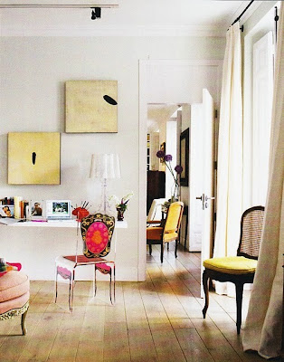
Probably my favourite corner - a simple floating shelf as a desk, paired with
a lucite chair and Stark lamp that leave it feeling so light and airy.
a lucite chair and Stark lamp that leave it feeling so light and airy.
{Photos: Pablo Zuloaga via French by Design}
|
Posted by escapade at 9:05 AM
Labels: interior styling, madrid, maria muro, spain
Wednesday, January 19, 2011
The best accessory: pink flowers
This bright, light filled space has a strong organic feeling with an emphasis on comfort - the deep shag rug, the soft curves of the Saarinen womb chair. The African wood stools and mica media centre add natural texture. While the space is predominantly neutral, there is just the right amount of colour in the art, pillows and of course, the pink flowers.
To me, they completed the whole space.
P.S. Congratulations to Lauren, who won the CSN gift certificate!
|
Posted by escapade at 7:45 PM
Labels: African design, mali azima, saarinen, womb chair
At home: Photographer Amy Neunsinger
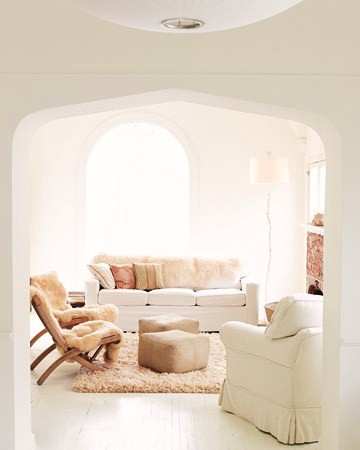
When I saw this photo recently featured at Blue Pool Road, I had to look further for more images of this beautiful space. Open, airy and flooded with light, Amy Neunsinger's Spanish style home in Los Angeles is full of soft, soothing tones. The plush shag rug and sheepskins in the living area make the space so welcoming and relaxing.
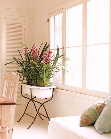
The vintage bathtub on a stand was an idea from Amy's mother to be able to bring a bit of the outdoors in.
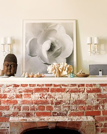
The mantle features a plethora of found treasures and a large black and white photo of a magnolia bloom, taken by Amy herself.
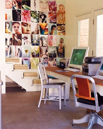
Amy's portfolio hangs on the wall of the office space just a few metres behind their home. I love the vibrant colours, it seems to be such an inspiring space to work in.
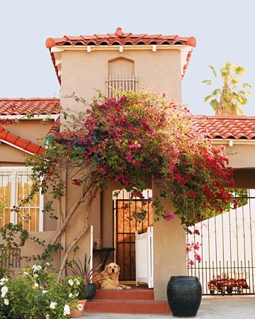
Bougainvillea will always be a favourite of mine, it surrounds so many of my childhood memories, and always evokes a feeling of lush warmth and vibrant colour even in the driest of climates.
{Photos: Martha Stewart, originally featured in Blueprint magazine}
|
Posted by escapade at 4:04 PM
Labels: all white, amy neunsinger
Subscribe to: Posts (Atom)

