Pages

    Showing newest 14 of 27 posts from 10/1/10 - 11/1/10. Show older posts
    Showing newest 14 of 27 posts from 10/1/10 - 11/1/10. Show older posts

    Friday, October 29, 2010

    Happy {Halloween} weekend!


    The spookiest weekend of the year, Halloween - and we're headed to a fabulous party at a friend's new art studio. For now I'll keep my costume idea secret until the party, but it involves some fluttery eyelashes, lots of sequins and sparkle and a few butterflies...  

    How about all of you? Do you celebrate Halloween? If so are you dressing up this year?
    Whatever you're up to - hope you have a really fun weekend! 

    Here are some fun links...

    For Halloween...
    - Heidi Klum, famously one of Halloween's biggest fans shares some costume tips. Take a look back at some of her most outrageous costumes.
    - Feeling like something a little more understated? (me too!) No doubt vampires will be as popular as ever with all the new shows and movies, rather than the traditional dracula, try a more subtle 'grown-up' vampire look
    - Thirsting for a little gore this Halloween weekend? Catch up on the new season of Dexter (already intense!) And here's a little treat for Dexter fans who love great design.
    P.S - I'd love to hear your Dexter theories if you have one!

    For anytime!
    - Louise's fantastically fun and fresh space featured in Real Living
    P.S- follow her blog and visit her shop!
    - a little painting magic. Fabulous transformations here and here.
    - read Adele's interview with Will from Bright Bazaar (love these two!)
    - loaded with delicious inspiration for Halloween and cozy autumn evenings - Sweet Paul magazine!


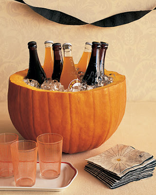
    {Photos: 1-Michael O'Brien for New York Magazine, 2- Martha Stewart}


    Misty autumn mornings


    I've been so enjoying my early morning walks with the dog lately. Autumn often brings the most beautiful surprises, as misty mornings - cool, damp and grey, completely shed their dreary tone as soon as you enter out into the bright fanfare of colour in the autumn foliage. As if by magic, the world is suddenly transformed into a rainbow of warm hues, and reminder to look on the bright side. Each softly fluttering golden leaf is a little bittersweet - a small reminder of autumn quietly slipping away...


    {All photos: La Porte Rouge}


    Thursday, October 28, 2010

    A flik of orange

    One of my favourite decor shops in town to explore new pieces and discover fantastic antiques is Flik and Company in Leslieville. Describing their own style as where French meets Industrial with a twist of mid-century. I was excited to see their own home featured in a recent issue of Chatelaine, and especially to see their newly decorated rooms for their little ones (two of the most adorable children in the city!). Here's a peak inside their own bedroom (below) and (second down). Filled with vivid, saturated colour that is so refreshing and energizing against the cool white walls. No doubt an inspiring space to wake up to!


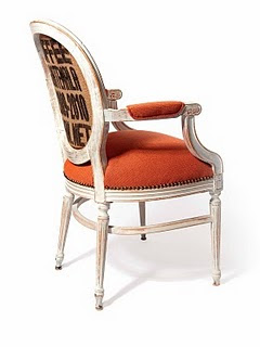
    Here is one of the new pieces from Flik by Design's new collection a classic white Bergere chair upholstered with a coffee sac back and a bright orange tweed. A stunning new update on a classic piece, and a little unexpected. Perfect for an Hermes inspired autumn palette.


    Be sure to visit the new Flik by Design at 1360 Queen Street East in Toronto.


    {All photos: Flik and Company}

    Sparkling lights for cooler nights


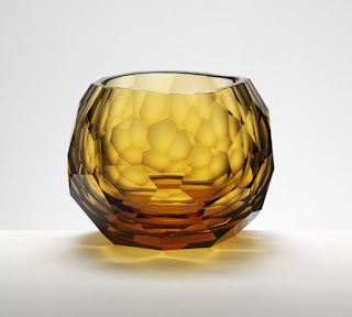
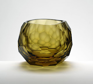
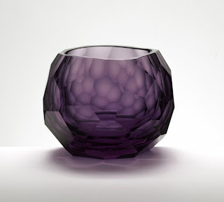
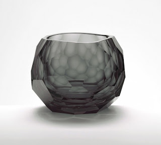
    As the weather turns cooler, we turn indoors to enjoy cozy nights with the the warm glow of candlelight. I was instantly dazzled by these beautiful crystal votives designed by David Wiseman for Artel. Beautiful gems of glowing light, add a little sparkle and glamour to your space. Like jewellery for your home.


    {Photos: The Glacier Collection by David Wiseman for Artel, via BTC discovered at Haute Design}

    Wednesday, October 27, 2010

    A classic twist


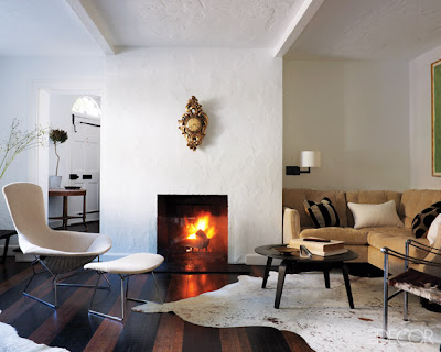
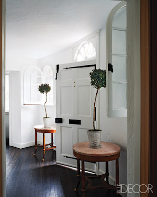
    This space has a beautiful balance to it - warm yet fresh, classic yet modern. Crisp all white walls contrasting with warm taupes, tan and caramel. Chocolate brown paired with dramatic black and white stripes. A minimal fireplace with an ornate gold clock floating above. A classic pairing of two topiary tree - but with an extended and slightly askew trunk, giving a sculptural and more relaxed feeling.


    {Home design + interiors by Bories and Shearron; Photos: William Waldron, styled by James Shearron for Elle Decor}


    Tuesday, October 26, 2010

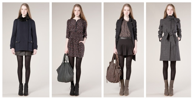
    Vanessa Bruno boutique

    Vanessa's aesthetic sense is echoed in her fashion line and her boutiques. Simple, uncluttered, uncomplicated, there's an easy confidence - no fancy embellishments, nothing to prove.


    Some favourites from her current Autumn collection:


    Monday, October 25, 2010

    An easy elegance: at home with Vanessa Bruno


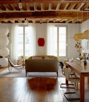
    There's a confidence about French style that just appears to be so effortless. This definitely holds describing the apartment of fashion designer Vanessa Bruno. Relaxed, casual, yet pulled together with a sophisticated edge, Vanessa describes her own style as "typically Parisian, chic but very relaxed and easy". The look is a mixture of traditional and mid-century elements, a perfect blend of the designer herself - her mother a Danish model in the 1960's and her father, the founder of French fashion house Emmanuelle Kahn. Her commitment to unfussiness isn't limited just to her aesthetic senses - it reflects her belief that beauty comes from living as uncomplicatedly as possibly.  
    The result is "peaceful, modern and delightfully easy."


    I love how Vanessa effortlessly mixes high and low items - (my favourite) a faceted David Exbrayat side table in the living area contrasted with casual Ikea lanterns.


    P.S. more easy, elegant French interiors - Sarah Lavoine


    {Photos: Mikkel Vang for Domino Magazine September '08,
    represented by the Taverne Agency via Style Made Simple 
    original article by Ruth Graham}


    Sunday, October 24, 2010

    A quick hello + a trip to Steven & Chris


    The week flew by at a furious pace -very productive and am quite happy to have many things crossed off the 'to-do' list but definitely looking forward to the weekend ahead! 
    One of this week's highlights was attending a taping for a special edition of the Steven and Chris show featuring an all-blogger audience. The boys, of course, were the perfect hosts and we all had a fantastic time. It was a morning filled with clever DIY ideas, delicious new recipes (followed by an equally delicious lunch!), an interview with the hilariously witty Jenny McCarthy, and of course their own special brand of banter, laughter and lots of fun.
    Our session closed with an intimate question and answer session with the boys, sharing design inspiration and also their own personal and professional journey together (Chris was even moved to tears!). It was really special and quite touching.

    Thank you Steven and Chris for a fantastic afternoon!


    The Steven & Chris Show was kind enough to offer one reader four tickets to view one of their taping so that you too can enjoy a fun-filled morning with our two favourite Designer Guys.
    (You must be able to travel to the CBC studios in Toronto to attend the taping).

    Please leave a comment below, and be sure to include your contact details so that the tickets can be posted to you.


    Hope you've all been enjoying a lovely weekend!


    Friday, October 22, 2010

    Better in black and white

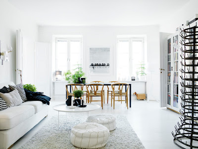
    Scandinavians always seem to have such a strong grasp of the powerful effect of keeping things very simple. Of course I'd expect nothing less in the home of Swedish stylist Lotta Agaton. The simplest of palettes - black and white, used throughout the space gives a beautiful sense of order and calm. Of course, the space is styled to perfection with interesting little vignettes throughout.

    While Lotta is obviously a talented stylist with a keen eye for detail, if you look closely at the details, these clever techniques could quite easily be adopted and implemented in your own space, even on a very limited budget. A simple sofa, floor lamp, and floating shelf all in white, black and white pillows in a bold graphic pattern could all be found at Ikea - giving you space in your budget for collecting beautiful objects and art that tell your personal story.


    {Photos: Lotta Agaton}


    Wednesday, October 20, 2010

    I like the way you say my name...


    I remain steadfastly in love with Alicia Bock's dreamy photography, the way she captures light is just pure magic. I've been lusting after this beautiful piece entitled, 'I like the way you say my name', it has a dreamlike quality that has me captivated. 
    I have just the spot for it.


    {Photo: 'I like the way you say my name' by Alicia Bock}

    Fresh in blue + white


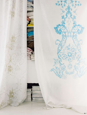
    Lately I've been filled with a burst of energy and the desire to 'get things done'. These pictures have such a clean, fresh energy about them, I felt inspired instantly.


    {All photos: Carolyn Quartermaine}


    Tuesday, October 19, 2010

    Little shots of happiness in bright colour


    Living in a big, busy city it's easy to feel over stimulated sometimes and I often find myself seeking the solace of calm, neutral spaces, however, there's no denying the shot of energy and cheerfulness brought by a shot of bright colour. While this space boasts classic architectural details and some beautiful pieces of furniture in timeless, neutral shades (like that stunning chair, below), without the bright artwork and accessories, I feel it could look border on looking a little drab or ordinary. The little shots of bright colour make this space pop and bright such a fantastic energy.


    See the initial scouting photos for this shoot at Style at Home editor Margot Austin's blog for the full before and after effect, and be wowed by the magic of a little styling and some fantastic photography.
     

    {All photos: Virginia Macdonald for Style at Home, November 2010}


    Good morning + a quote on happiness...


    I stumbled upon this unexpectedly yesterday, while waiting for an appointment. 
    It instantly shifted my focus, and I was grateful for it. 
    Hope you enjoy it too!


    {Photo: Miles Redd's front door as featured in Domino}

    Monday, October 18, 2010

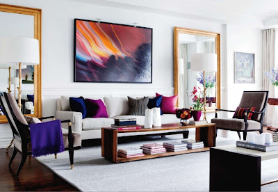
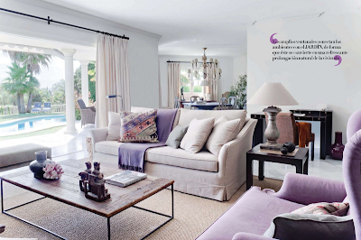
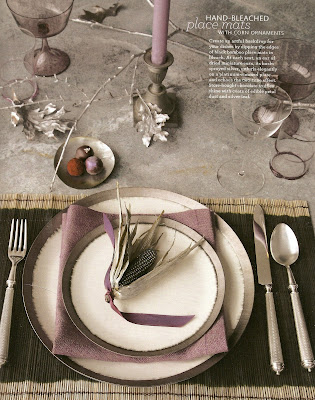
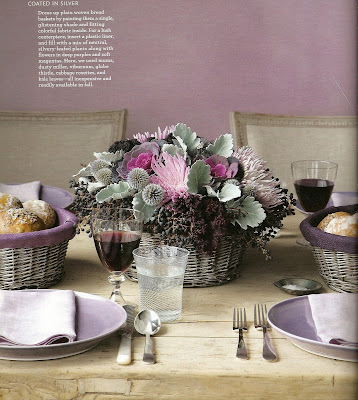
    An unexpected autumn palette: Lilac and Silver


    As much as I love the golden, firey tones of autumn and the warmth they bring in the cooler months, I generally tend to lean more towards the cooler tones of blues, greys and purples in my own home, so I was quite excited to see these autumn tablescapes in shades of lilac and silver. While there's a wonderful nostalgia to traditional colour schemes and palettes, I love the idea of making the holidays your own by incorporating the colours and themes that make you most happy to be surrounded by.


    Clearly this palette has often been on my mind lately
    - more smokey blue and lavender spaces here.


    Hope your week's off to a great start!
    xo

    {Photos: Interiors 1,3,5,7- Interiores Magazine via Delight by Design,
    2,4,6 Don Freeman for Martha Stewart Living magazine, November 2009, scanned, edited for escapade}


    Newer Posts Older Posts Home