Pages

    Tuesday, June 28, 2011

    At home with minimal modern

    The flurry of the past little while has me craving a little bit of tranquility and space to collect my thoughts and get organized. While this space is probably a little more minimal than what I would normally choose, right now, it feels like it would be the perfect escape. Free from visual clutter and the busy-ness of colour and accessories, it is a blank slate to unwind and empty my mind.


    While Jonathan Adler is famously known for his maximalist tendencies, this beautiful mid-century inspired chandelier he designed works perfectly and adds a bit of glamour to this minimalist space.


    The black Beroia chairs have a grounding effect on the otherwise light and airy space, their low profile and mesh design stop them from looking too heavy.

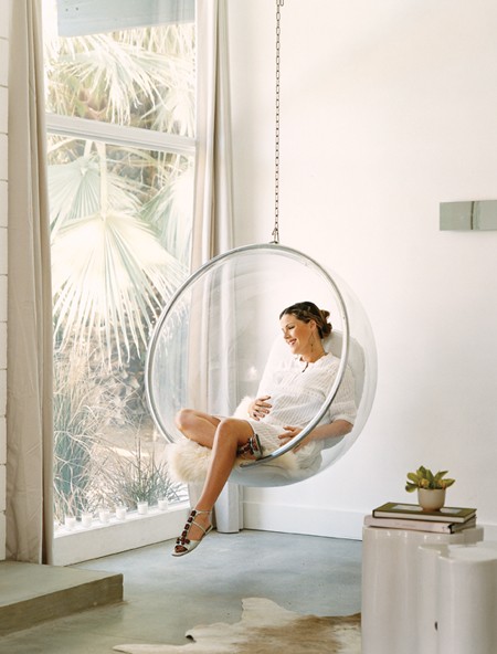
    Homeowner actress Kathleen Roberts (from Beverly Hills 90210) relaxes in an acrylic bubble chair.


    Monday, June 27, 2011

    Inspiration for the new week 27.6.11

    How is it the end of June already? I feel this month has flown by at a ferocious pace and the hectic schedule has left me feeling a little discombobulated. Starting to slowly climb back on track, and finding comfort in the fact that whatever point you're at, it's never too late for a fresh start.

    Happy Monday!


    {Photo: Paul Costello for Domino magazine}


    Thursday, June 23, 2011

    Pretty pieces in black + white


    With my deep affinity for crisp black and white, I was extra delighted to see the new expanded dinnerware collection from Kate Spade. Simple, striking designs to add a little charm and whimsy to the table. I'd love to get a set with one of each of these styles, all different but united by their common black and white palette.


    {Photos: Kate Spade


    Simple drama


    While I may flirt with colour from time to time, I can never stop myself from being drawn right in to a classic case of 'black and white done right'. Rustic ceiling beams and a rather primitive looking coffee table look sophisticated in a high contrast black and white frame.


    {Photo: Elle Decor Italia Feb '10}


    Monday, June 20, 2011

    Inspiration for the new week 20.6.11

    A little quote on perseverance for what feels like it's already been a marathon working week...


    domino magazine daisy

    Wishing you a wonderful start to the week!


    {Photo: Domino February '08 via mscott}

    Thursday, June 16, 2011

    Gallery walls

    Sorry for the rather sporadic posting recently, I've been busy working on a special project involving a gallery wall installation, so they've very much been on my mind recently. I like it when things are a little off kilter or there's an unexpected twist. Here are a few walls that I've found particularly inspirational.


    {All images from }


    Tuesday, June 14, 2011

    At home: Jordana Brewster

    It seems that lately whenever I see a new In Style magazine on the shelves, I immediately flip to the back in search of a beautiful interior and features like this one are exactly why - every now and then there is something amazing. Jordana Brewster's 1960's A frame home is stunning architecturally, with tall, white washed cathedral ceilings and soar and inside, there is a soft, breezy feeling of laid back California cool. If there is something positive to come of the fact that there have been so many Fast and Furious movies, it must be that Jordana Brewster was able to create this beautiful space.


    The upper loft really is the perfect sanctuary, tucked up above the living space and boasting a few that seems to stretch for miles. I love that the wood on the ceilings has been whitewashed to soften it, but not completely, so the warm natural wood tones still come through.


    The white spiral staircase has an airy, sculptural feeling against the strong straight lines of this A framed space. I love the burst of bright orange from the cabinet. These bright spots of colour (in the cabinet, above, and books, below) keep the space from too neutral and add a bit of edginess and fun.


    The neatly folded throw at the foot of the bed and the swimming pool seem to be exactly the same shade of pale aqua blue.

    It seems the whole home is designed around the concept of seamlessly living indoors and out with ease. Definitely a bonus of living in a warmer climate.

    From the open, lounge-y living area to the bright kitchen, this space seems perfect for entertaining friends. The glossy pale grey kitchen cabinets are a beautiful, subdued alternative to all white, but still look crisp and clean. (Well done to the stylist who added the wispy cherry branches - they were just the perfect touch!)


    {Photos: Dean Kaufman, Designed by Chiara de Rege, featured in In Style magazine May, 2011 
    via Elements of Style

    Thursday, June 9, 2011

    Go for bold!


    While I always go back to my tried and true palettes of black and white, or all white, lately I've been enjoying a bit of an affair with bright colours. While soft neutrals may be soothing and classic, there's something just so fun and energetic about bright colour. They literally make you a little happier just to see them. This home, previously featured in O at Home, has a wonderful sense of whimsy and fun. It almost feels like a gallery in that each piece could really stand on its own as a work of art. While there are lots of accessories and interesting objects throughout the space, there's also a feeling of minimalism and space between them which prevents them for appearing too cluttered and allows each piece a chance to be appreciated on its own. While I admit that my own home is much more subdued and classic, I very much admire the sense of bravery it takes to be a bit more risky and go for bold and create a truly unique space that really speaks to the individual who inhabits it, and doesn't hide behind the boundaries of what's 'safe'.


    {Photos by Eric Laignel, Design by Ghislaine Viñas, Styled by Katherine Hammond}


    Bands of bright colour: Artist Caleb Siemon


    This bright banded glass collection from Caleb Siemon really is a treat for the eyes. The colours are rich and saturated yet translucent, creating an intense glow as the light passes through. Caleb discovered his love for glass work early on, "Most glassblowers aren't born artists," he says, "they're born pyromaniacs." Having studied glass work in Rhode Island, he moved to Murano where he spent two years as an apprentice to master glass sculptor Pino Signoretto, being encouraged to "steal with his eyes", and learn from watching the masters at work. His work definitely shows his flare and passion for the craft. Each of these is truly a work of art on its own, all you need do is simply find a space filled with light to let the piece truly radiate.


    {All photos: Caleb Siemon}


    Wednesday, June 8, 2011

    At home: Jennifer Aniston's new home in New York


    I have to admit, I was a little surprised to see Jennifer Aniston's Beverly Hills home previously featured in Architectural Digest, it seemed a little more 'bachelor' than 'bachelorette pad' to me. I was quite curious when I heard of her new purchase of a New York penthouse suite, and wondered what direction she'd take with this space. While we have yet to see what her decorating style will be in this new home, we can enjoy a bit of a sneak peak as this space from an earlier feature in Elle Decor on the home of Sally Hershberger, its previous owner. I love how open and full of light the space is - perfect for showing off Sally's extensive collection of art (one of my favourite features). No doubt Jennifer was also wooed by the extensive outdoor space - quite incredible by New York standards.

    Monday, June 6, 2011

    Working inspiration 6.6.11


    Flower Films Offices


    {Photo: Stewart Shining for Domino magazine, April '08}


    Thursday, June 2, 2011

    Sending a little love + a little give-away


    I recently came across the prettiest cards - bright, bold swirls of colour, with a sweet but subtle heart behind. Perfect for sending a little love to someone special or even as a piece of art on their own. I love the play of pattern and colour.


    What's even better? I quickly noticed that they were created by a blogger friend, Adrienne of Mustard Seed Collective who has now moved on to sell her own line of cards on etsy. When I wrote to congratulate her on this pretty new collection, she offered to give a reader their choice of three cards from the shop. To enter the give-away, simply visit the shop then leave a comment below letting us know which ones you'd pick.

    This give-away is open to all readers, everywhere :)
    (yes, finally - international readers included!)


    Wednesday, June 1, 2011

    {Unexpected style} At home: Campbell Brown


    To be honest, I'd never really given much though as to what former CNN host Campbell Brown's home might look like, however, if I had, I never would have guessed that it would look like this. I would have expected something a little more traditional. If you've been reading this blog for awhile, you'll know I love a good unexpected twist, so I was quite delighted to see this space. This bright loft has a very laid back 1970's style with bursts of colour throughout. The bright artwork is by Campbell's mom, artist Dale Fairbanks.


    {Photos: Instyle Home magazine via Apartment Therapy}


    Pretty pieces in white: Architectural models

    Inspired by the Renaissance church domes of Florence and Sienna, these pretty porcelain pieces would be a very fun way to add a little instant architecture and cosmopolitan style to a bookshelf or mantle. A little more unexpected than a typical vase or sculpture, and with just a touch of whimsy.


    {Photos: AM Living}


    Newer Posts Older Posts Home