- Art
- Architecture
- House Tours
- Fashion
- Photography
- DIY Ideas
- Etsy Finds
- Travel
- Book reviews
- Toronto Guide
Pages
Showing newest 16 of 29 posts from 2/1/11 - 3/1/11. Show older posts
Showing newest 16 of 29 posts from 2/1/11 - 3/1/11. Show older posts
Monday, February 28, 2011
Inspiration for the new week...
|
Labels: calendar, desk, home office, inspiration, office, pablo picasso, quotes, workspaces
Sunday, February 27, 2011
Wanderlust: Hotel St Paul, Montreal
Discovering Fuschia- l'epicerie fleur, has had me thinking about all the wonderful possibilities in Montreal and exploring some of their beautiful boutique hotels. The Hotel St Paul had such a contrast of warmth and cool, fire and ice - a little bit of drama flair that seems to suit the city so perfectly.
|
Labels: boutiques, canopy bed, carrera marble, fireplace, hotel st paul, hotels, montreal, travel, wanderlust
Friday, February 25, 2011
Fuschia | epicerie fleur
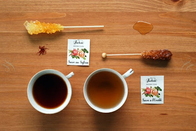
A most charming little cafe that has me trying to organize a little road trip to Montreal (immediately!). Everything they make at Fuschia is made of or infused with edible flowers such as rose, violet or lavender. In addition to hearty meals and delicious treats, they've also created artisanale products for the home, bath and the kitchen for you to take away and enjoy. With an ecologically responsible approach and a focus on local, natural ingredients, it would be a little indulgence you could truly feel good about.
Visit Fuschia in Montreal, and here online.
{Photos: Fuschia}
|
Labels: cafe, epicerie fleur, fuschia, handmade, honey, lavender, montreal, roses, violets
Thursday, February 24, 2011
Up in the clouds...
This room is so wonderfully light and airy in bright white and light grey. Wispy shear curtains and ornate mouldings make make it almost feel like you're up in the clouds.
Tibi: Spring 2011
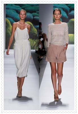
If the images over the past few days are any indication, lately I've been growing impatient waiting for Spring and longing for warm breezes, light fabrics, simple forms and bare legs (and no coat!). The Spring 2011 collection by Tibi fits the bill just perfectly - classic, timeless designs in neutral shades with a few pops of bright, saturated colour (including an orange-red - my favourite for summer pedicures!)
Tuesday, February 22, 2011
Fresh + clean
There's an incredible feeling of light and air in this beautiful bedroom, I can almost feel a soft breeze flowing through the sheer canopy. A simple yet dramatic space, with floating steps ascending to a walk in closet in the loft. So pretty in all white with a crystal chandelier floating above.
Today I was invited to guest post at one of my favourite new blogs - Atelier Turner. Stop by to see 5 of my favourite design elements and say hi to Tricia!
{Photo: RUM via Atelier Turner}
Monday, February 21, 2011
Simple statement
While I've flirted with maximalist tendencies, more often than not in recent times I keep coming back to the notion that simple is best. Often one or two things in a space carry more impact and allow you to appreciate them fully when they're not competing for attention with other objects. Much like a page with one or two statements will force you to contemplate each word and often carry more weight than a whole page full of writing.
The black staircase really creates an anchor juxtaposed with the airy white walls and ceilings. The indoor plants throughout the space give it a sense of tranquility and calm and stop it from looking too sterile or unapproachable.
One of my favourite parts of this space - the large round mirrors. So simple yet a little unconventional in a round shape. Contrasting beautifully with all the straight lines in the space and reflecting the abundance of natural light.
I think my favourite shot (above) love the dramatic contrasts and the glossy black grand piano reflected in the mirror.
{Photos: Giorgio Possetti for Elle Decor Italia, discovered via Aubrey Rd}
|
Labels: architecture, black + white, black and white, elle decor italia, giorgio possetti, modern
Sunday, February 20, 2011
Wanderlust: Ace Hotel, Palm Springs
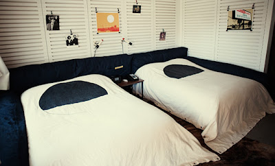
The Ace Hotel in Palm Springs seems to be a wonderfully laid back escape. Like visiting your cool hipster friend's cottage. Built on the foundations of an old Howard Johnson it's been transformed from generic chain hotel into something unique with a character all of its own. Each suite is furnished with vintage furniture pieces andunique touches of art and memorabilia, casually pinned on the slatted wood frames. Some rooms even feature vinyl record players en suite.
A wonderfully unpretentious atmosphere to really relax and take in the view of the mountains in your hammock or float away in the pool with a boozey sno cone.
The bigger suites come with their own private patio complete with fire pit. Perfect for lounging with friends. (Love the Acapulco rocker!)
One of my favourite features of the Ace Hotel - you can even bring your dog along!
{Photos: Ace Hotel, Palm Springs}
Thursday, February 17, 2011
Thrill of the find
Earlier this week, I was excited to have a chance to visit some of my favourite antique and thrift shops, always one of my favourite ways to spend an afternoon. While I came home empty handed, there's still something so fun just in the process of looking, hunting for that hidden treasure.
I am feeling quite envious of these little treasures found in the Paris flea markets by Garance Dore - a vintage camera and YSL scarf, and a rather elegant sculptural lamp.
Elegant simplicity
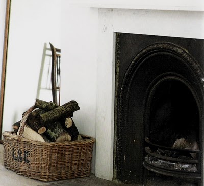
As tiny glimpses of Spring begin to appear, I'm starting to resist winter a little less, knowing it'll be over soon enough - and trying to savour the special moments that only seem to come during this season. Enjoying the crisp air and coming in to a comfortable chair in front of a glowing fire. There is a certain coziness about winter that different from any other season - and always the perfect excuse for another cup of tea.
Wednesday, February 16, 2011
Breathing space
Right now I'm craving a little breathing space for my busy mind. Somewhere clean, calm and without distraction to unwind. I love the simplicity of these spaces - uncomplicated but still interesting.
{Photo: 1-VT Wonen, 2- MarieClaireMaison}
Tuesday, February 15, 2011
So fresh! {Lili Diallo's loft}
Stylist Lili Diallo's Brooklyn loft has been one of my all time favourite spaces since I first saw it on the pages of Domino. There's a freshness and feeling of life and vibrant creativity that permeates it. Clean all white with pops of bright colour that let your eyes dance between the carefully crafted vignettes. Lili who is originally from Paris, has definitely brought her French sense of je ne sais quoi and being able to mix styles, eras and colours with a comfortable ease that make it almost look accidental.
'I'm not totally into modern or classic,' she says, although she admits to loving white furniture and white lacquer in particular. 'It's clean and reflective,' she says. 'I'm also keen on the Swedish Gustavian style – sensuous lines in greys and blues. But there are things I like from every period.'
Lili repainted in white throughout, but the big wooden beams, plus rugs and plants, keep the look cosy.
I like things a bit rustic,she adds. The white backdrop showcases curvy Panton chairs, which add a contemporary flavour to a classic dining table left by the landlord. Rubber plants – echoed in the graphic-print tablecloth – tie the look together.
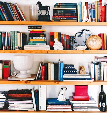
Forever embedded in my mind as the perfect curated bookshelf.
I don’t like a space to be “one note” – everything modern or mid-century,says Lili, who admits she likes to ‘break the rules a bit’. Throughout her home, Lili has mixed together furniture and accessories from different eras.
I like to have lots of things around my office that fire me up for my work, such as mood boards and inspiration walls,
{Photos: Domino magazine via Habitually Chic, quotes from Living Etc}
|
Labels: at home, bright colours, Brooklyn, dining chairs, Domino, Lili Diallo, loft, panton, stylists, white
Monday, February 14, 2011
At the end of the day...
...all you really need is love.
Suede All you need is love pillow by Honey Pie Design
{Photo: Honey Pie Design}
Friday, February 11, 2011
Sending you ...
Nothing ever beats a handwritten love letter. On Valentine's Day, or especially when it's unexpected. Seeing the message in someone's own handwriting, no matter what it looks like, makes it feel much more heartfelt. I love the idea of spreading your secret message over a few days with a series of postcards. It'd be a fun way to surprise them, and keep them guessing...
While in most cases, it's a little late for 'snail-mail', there's definitely still opportunity to send a note to your special someone, if not in person, then with these cute little e-cards from Kate Spade -such a fun little tradition I've come to look forward to from Kate every year. Each is designed by an artist friend of the brand, there's a whole gallery from which to select the right one for your special someone.
{Photos: 1-Martha Stewart Living via Dress, Design, Decor 2-4 Kate Spade}
|
Labels: calligraphy, Kate Spade, Martha Stewart, post cards, stationery, valentine's
Thursday, February 10, 2011
Red in the bedroom?
Feng shui experts believe that you need at least a little of the colour red in your bedroom to ignite romance and passion. I've always opted for soft soothing tones of blue, grey and lilac (exactly the opposite of what they recommend.) To be honest, I really can only handle red in smaller doses, the idea of an entirely red room just seems so heavy and a bit too intense for me. While I doubt I'd ever paint the walls red, I'd never even considered the idea of a red ceiling. I just love the soft warm glow it gives the room. This is a fun way to introduce spot of bright colour without too much of a commitment.
I'm still not convinced I could handle the red, I think little bits of bright pink is about as close as I will get to feng-shui bliss, but how about you? Are you a red person?
{Photo: Magnus Anesund discovered via coco+kelley}
Pretty pillows in pink + red
While I'd almost forgotten about it, it seems a certain holiday must be upon us, as blush pink and bright red tones can be seen all around. These pretty pillows by Scholten and Baijings seem to fit perfectly with the holiday colour theme. A lovely way to add a rosy glow in the middle of this cold season. The simple stripes make them a little less girly.
Subscribe to: Posts (Atom)


