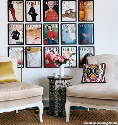
Looking back at an old issue of Domino, this soothing space by designer Antoinette Loupe caught my eye. I had tagged it as a favourite some time ago. I love the play between the warm wood and bright light, traditional and mid-century modern styles, and the artful arrangement of so many beautiful decoratives. I tried to look up more of Antoinette's work, but sadly it seems this is all I could find.

Showing newest 16 of 23 posts from 5/1/11 - 6/1/11. Show older posts
Showing newest 16 of 23 posts from 5/1/11 - 6/1/11. Show older posts
Tuesday, May 31, 2011


Monday, May 30, 2011


Friday, May 27, 2011
Art inspiration: vintage magazine covers
A friend and I were recently having a conversation on how magazine covers have really shifted over the years. Recently there have been quite a few models speaking about the fact that they are rarely used on covers anymore (at least in American editions) and it's all about celebrities. It seems that these days you have sing, dance, act and also happen to be stunning to land a cover. I think that in itself is an interesting topic to discuss, and also speaks to how commercialized everything is (as these covers are often to promote other projects, movies etc). Looking back at older editions of magazines, I can't help but think that the covers were more artful and often, works of art themselves. A good friend shared some beautiful examples here (+ see below) and started me thinking about this. I can't imagine any of these being on the cover today - I'd definitely pick them up if they were - how creative and interesting! I love the lack of a dozen different distracting cover stories each competing for your attention.


I do still really love many of the Vanity Fair covers. This one in particular (below) was one of my favourites and I plan to frame it one day.

All this being said, magazines have and will always remain a passion of mine and the source of many of my favourite little moments of personal indulgence and always, so much inspiration. I really love the idea of framing a whole set of them as a bright, bold and beautiful art statement. A lovely homage to one of my most favourite things.
You can find beautiful vintage magazine covers and art here, at the Conde Nast store online.
{Photos: 1-3 via Suite Henry; 4- Vanity Fair;
5- saved from my little stash of Domino magazine archives}
Thursday, May 26, 2011
Fresh in green
Perhaps it's the abundance of rain that has left the entire landscape in the most brilliant shades of emerald, but lately I've keep finding myself drawn to bright pops of green in decor. (Like these umbrellas, or these barstools) There's something just so irrepressibly fresh about this shade!

Lee Kleinhelter always manages to incorporate bright bursts of colour with more traditional pieces and styles for a look that is fresh and fun. These photos from her home previously featured in Cottage Living are so inviting. A beautiful burst of fresh colour without being too loud or intimidating. Crisp kelly green always has a bit of a preppy edge to it, don't you think?

{Photos: Cottage Living}
Big dreams + Bright colours
Something I've started to do recently, is carry a 'Little book of Big Dreams'. I truly believe that you can accomplish anything you set your heart and mind to, and this is a wonderful way to keep track of growth, progress or sometimes even a change in direction. If you've never tried it you really should, the results can be simply miraculous. I keep a Little book of Little Dreams too, trying to capture those fleeting moments of inspiration and pay attention to those little details or changes that can sometimes make all the difference.
Just as drinking plain water out of a beautiful glass can really elevate the experience, I think that beautiful writing instruments and notebooks can make any simple note taking a little more inspired.

I love these bright picks from Kate's Paperie. I'd take one of these
little notebooks in every colour!

Wednesday, May 25, 2011
Working style: The Lonny Offices
I was absolutely thrilled and inspired to see the newly revealed Lonny offices in the May/June issue. I think I went back and looked through each page about three times before proceeding with the rest of the issue.I couldn't help but think as I did, 'This is exactly the type of article I miss from Domino!' Very chic with a perfect blend of high and low, with lots of interesting little twists and personal details. I love that the space is completely filled with art of all kinds. With a space like this, I think I'd be signing up to work over-time!


See the whole tour and a break down on getting the look yourself in the Lonny article here.
{Photos: Patrick Cline for Lonny May/June 2011}
Monday, May 23, 2011
Inspiration for the new week 23.5.11
To a special friend who's just announced she's about to embark on an amazing adventure...


{Photo: }
Friday, May 20, 2011
Looking up through the leaves
After the stark barrenness of winter, one of my most favourite things to do in summer in lie back, and look up at the sunlight softly filtering through the leaves on the trees above, creating a luminous lacy green glow. This pretty outdoor parasol designed by Chris Kabel, brings that under the trees effect wherever you place it.

While sunny afternoons seem to have temporarily eluded us, you can enjoy the sunlight coming leaves even through the rain with this pretty umbrella by Ella Doran.

A cheerful entrance
It's all too true that often the easiest transformations can be achieved with just a single coat of paint. I love how fresh and modern this entrance looks with a slick coat of bright orange paint contrasted against the classic details and hardware.
A very easy weekend project for a transformation that will have you looking forward to get home all week, just to be greeted by your cheery front door.


Thursday, May 19, 2011
Black, white + artful
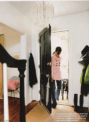
Ashley Edwards home as featured in Domino, is like the Mary Poppins of homes to me - 'practically perfect in every way'. It's remained a favourite of mine since I first laid eyes on it, and keep coming back to it for inspiration. It really strikes a cord with me with its slick black and white scheme throughout the whole home, with pops of bright colour brought in through little accents and lots and lots of art.

There's a lovely sense of playfulness, vintage pieces mixed with sleek modern and pop art. It really feels like a space that was fun to put together and that is meant to be lived in and enjoyed.


Basic white modular office pieces pop against the slate grey walls and puts the focus on a wall full of inspiration and colour. The vintage chair upholstered in black and white stripes and accessorized with a yellow pom pom pillow adds a touch of whimsy to a space that's more work than play.

Throughout the home, Ashley has used touches of natural elements - jute rugs, woven baskets and stools. It really tones the strong black and white scheme that can sometimes be a little too dramatic or harsh.

I love how all the doors were painted in a glossy black - adds a sophisticated touch, and the crystal doorknobs add a refined vintage feeling.

The bedroom is an elegant and tranquil retreat. A little more muted and subdued than the rest of the home and with less colour and art, but still consistent to the black and white theme. Seems like the perfect space to rest your head (and your mind) at the end of the day.
{Photos: Paul Costello for Domino magazine November 2005, via MA Belle}
Wednesday, May 18, 2011
Artist: Natasha Law
In spite of the rather dreary weather forecast, this bright, summery paintings by artist Natasha Law (Jude's sister) have me feeling a little more sunny inside. Love how simple yet powerful they are, almost abstract in their vibrant colours. There's a delicate feminity in the images that strikes an interesting contrast with the strong colours.


Tuesday, May 17, 2011
Starting off organized
Recently, I was happy to be included in a group of fabulous bloggers, each sharing a favourite organization tip on Decor Happy. While sometimes I can feel that I'm barely holding on at the seams with things as life gets progressively hectic, one area I've always been vigilant about is my drawers. Since my early teenage years, I've had a persistent obsession with dividing and compartmentalizing my cosmetics drawers often using found containers (like old sushi trays or chocolate boxes) for storage.
I dream of a calm little oasis of organization like this beautiful dressing room to start my days (or evenings) on the right note.

A fun way to add a little splash of colour to a space - casually accessorize with a favourite silk scarf. A fun burst of bold pattern and so easy to switch out according to your mood.
While wallpaper can sometimes look a little 'heavy', here the delicate details used just on one feature wall look airy and fresh.
While wallpaper can sometimes look a little 'heavy', here the delicate details used just on one feature wall look airy and fresh.

I'm a firm believer that spending a little time and getting a few tools (like these drawer organizers) to organize your drawers is one of the best investments you'll make. Starting off the day without the mad panicked flurry to find everything just sets things off on the right note. Being organized just makes life easier!

Starting off the day in this lovely attic dressing room must surely lead to better mornings! I love how airy and bright this space is - especially in this type of attic room which can sometimes feel a little claustrophobic.
{Photos: Michael Graydon for Style at Home}
Monday, May 16, 2011
Inspiration for the new week 16.5.11


{Photo: the cover shot for the very first Domino magazine in Spring 2005,
taken by Melanie Acevedo, featuring designer Ruthie Sommers.
That settee in David Hicks' bright La Fiorentina still makes me smile everytime I see it.}
Wednesday, May 11, 2011
Bubble series
I recently was excited to stumble upon the "Bubble series" by photographer Melvin Sokolsky in an older issue of Real Simple. Created for the Harper's Bazaar Spring Collection in 1963, the series depicts model Simone D'Aillencourt floating through the city of Paris in a large plexiglass bubble. I was instantly captivated by the ethereal images of the glamorous model floating around the city as if in a world all of her own. What's quite remarkable is that this was long before the days of photoshop. Melvin is a self-taught photographer, whose talent and creativity were fueled by his passion for the medium. I find his stories and images to be incredibly inspiring.

"I have always loved telling stories. Early in my career, I found myself compelled to tell stories with my pictures. Stories about people who breathe and feel and suffer and dream. Stories that explore and create different worlds within the world we all live in."

"Next to my bed I keep a notebook that I write in sometimes while I’m half-awake, early in the morning, when a dream has insinuated a place or world I have never visited or seen. With my eyes closed, I scribble into the notebook and then go back to sleep."

"I have always been attracted to everything nature has to offer. I cannot think of any plant,
animal, or creature that inhabits this planet that has not fascinated me."
animal, or creature that inhabits this planet that has not fascinated me."

"In my life, indulging my vision has brought many surprises that I would have never thought of consciously. It is this chemistry that I believe is the creative force in all of us."

{All photos: Melvin Sokolsky for Harper's Bazaar, 1963}
Just add green...
I keep coming back to this simple arrangement - nothing fussy or overdone. Unfussy, streamlined pieces with a beautiful series of framed black and white abstract prints and an oversized vase full of greenery. Nothing fancy, just fresh sprigs of leaves, likely gathered in the garden. It really brings this space together and makes it feel so much more alive. Such a simple way to bring a little more of the outdoors in.

{Photo: Elle Decor April 2011 via Destined to Design}
Tuesday, May 10, 2011
At home: Susan Hornbeak-Ortiz
One colour that never fails to draw me right in has always been bright aqua blue. There's always something so irresistably fresh that it brings to any space. I was delighted to discover the home of Susan Hornbeak-Ortiz, the creative mind behind Shine by S.H.O., recently featured in Riviera Interiors. Throughout her home, Susan has incorporated splashes of bright aqua blue from her collection for a look that's clean, fresh and fun but still has a sophisticated edge.

This chaise has me regret giving up on my search for the perfect navy blue fabric for a sofa. I really feel navy blue is underused in interiors. It always has such a crisp, classic look and blends so beautifully with a wide variety of colours.
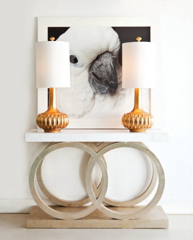
I'm not typically a 'bird person', we had an African grey parrot growing up and despite his amusing antics, he had a strong evil streak that has left me feeling a little wary of him and any comrades. While I may have a bit of a bird phobia in general, one bird that I've always had an affection for are Cockatoos. They have such a playfully mischieveous quality and always look like there are smiling. I'd taken some exta maths lessons in high school (never my strong suit) and my teacher had a pet cockatoo who used to hang out with us during the lesson. Sometimes even climbing on my shoulder while I worked (which was fun except when he tried to pull out an earring.) If I were to get a bird one day, it would definitely be a cockatoo - so I especially enjoyed this little guy :).

Love how aqua blue and yellow add such a bright, fresh touch to the bedroom - I automatically picture the the glass doors opening up to palm trees, shimmering aquamarine water and a soft sandy beach.

The colours add a playful vibe that balance out the more formal furniture. Paired with a few adorable plush animals, it creates a perfect children's room. (Although I'd happily move right in - plush toys included!)
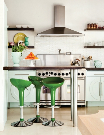
Immediately filed away under 'Dream Kitchens' - this kitchen has just the right amount of colour for me. The kelly green stools are a bit of an unexpected twist. I feel like this kitchen would somehow even inspire healthier eating. I'd love to move right in and start creating a little culinary magic with a lots of fresh fruit and vegetables.
{Photos: Peden + Munk for Riviera Interiors}
Subscribe to: Posts (Atom)