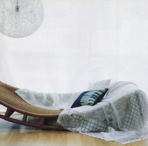
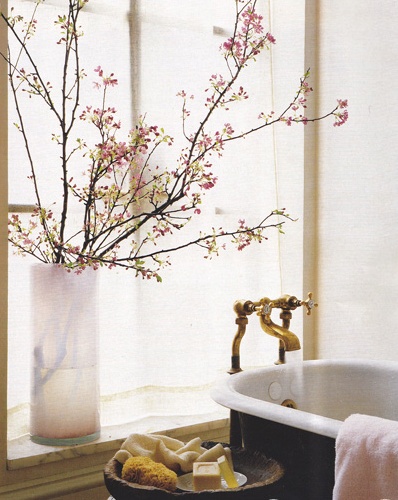
Always classic in black, white and gold. All white surfaces, strong black accents and lots of gilded details. The result is classic, fresh and definitely a little sophisticated. The suites at the Hotel Pulitzer in Rome are testament to the strength of a simple theme used throughout a space. While the look is thoroughly modern in its simplicity, it still has a warmth and comfort that invites you in to stay a little longer in this refreshing space.
I love how they've spaced these mismatched frames, making this quad act as a unit. An easy trick to use - and a more streamlined alternative to a gallery wall.
Black + White has been a big theme in our home, but this space makes me think about trading in silver and pewter accents for gold.
{An apology in advance - posts may be a little sporadic this week as I busily scurry around town trying to sort out little details before our big move this week. As the end of the month is approaching with almost a dizzying speed, I find myself happy, excited and exhausted!}
Hope your week's off to a great start so far - it's beautiful outside!
{All photos: Hotel Pulitzer, Roma discovered at Aubrey Road}


