
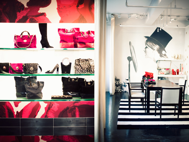
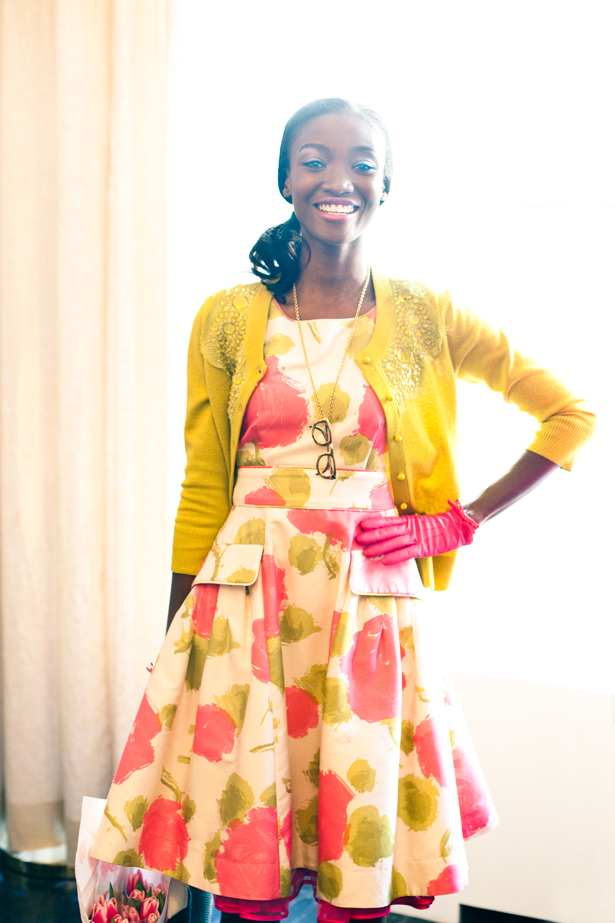
These behind the scenes photos at the during Fashion week put me instantly in a good mood. A very mod, 1960s vibe in bright saturated tones of fuschia, bright orange and lime green, and hints of rhinestones and leopard print. This collection definitely has me wanting to subscribe to Kate Spade's resolution this year to 'live colourfully'.


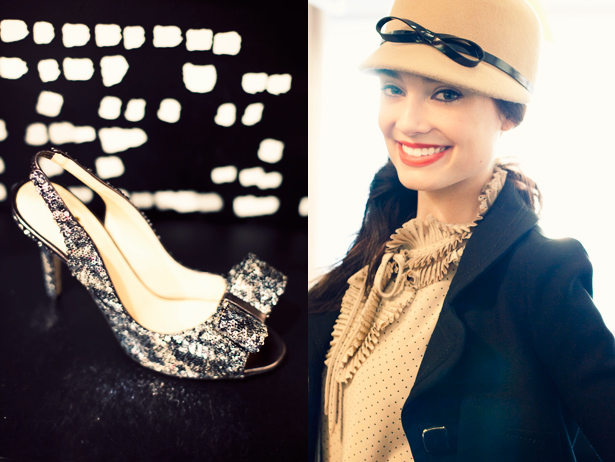
Doesn't this model have a very Audrey Hepburn quality?


See more from this shoot at .
{All photos: }
8 comments:
I a smiling already! Such a beautiful colours. Have a lovely day, sweetie
Kisses
Ps: I’m hosting an EmersonMade GIVEAWAY today! Just in time for spring:)
My morning is full of color now! I love bright tights!
All those smiles and all that bold, vibrant color puts a big smile on my face too! :) It just looks like such a bright and happy time! Kate Spade just does that (and what brilliant marketing too!), every time you think of them, you can't help but smile!! :)
So gorgeous- KS can do no wrong in my books. Her gorgeous use of colour is so ispiring.
Love the colors..so fresh and alive. Very much my style...ladylike and elegant but with a modern twist..fabulous!Stop by..doing an amazing giveaway, a pair of Murano handblown glass lamps
www.theenchantedhome.blogspot.com
Lovely frames - I'm very into picture collages like those!
I adore her so much! Love her collection and I cannot wait to be rich enough to buy everything in this post.
So pretty and happy! I love the new Kate Spade ad campaign...it's just the right choice of bright colors.