Pages

    Showing newest 14 of 17 posts from 10/1/11 - 11/1/11. Show older posts
    Showing newest 14 of 17 posts from 10/1/11 - 11/1/11. Show older posts

    Friday, October 28, 2011

    Love the look: layered jewellery


    We've come to associate autumn as a season of layering, this is generally relegated to clothing, but lately I've been loving the look of layered jewellery. While I tend to favour a bit more of a minimal look with jewellery and accessories, I've been having fun of indulging my inner maximalist and loving the look of multiple pieces all worn together.  A bit of a break from the ordinary and an easy way to create a big statement with a few simpler pieces to balance out the heavier layers of fall clothing.


    Princess Diana wears both her own and Prince Charles' watches during a 1981 polo match.


    How much is too much? This might be getting close (above).


    Done right, each piece really compliments the others and gives it a greater impact than it would have on its own.


     2 - via ; 3- Honestly WTF}


    Thursday, October 27, 2011

    Bright white and warm wood


    It seems to be another example of the Scandinavian knack for finding a perfect balance and creating calm, serene spaces. Here the bright white walls and pickled white floors counter the warm teak dining set. It creates an almost gallery effect to really show off the sculptural shape of the chairs and showcase them as pieces of art in themselves.


    Hot Stepper

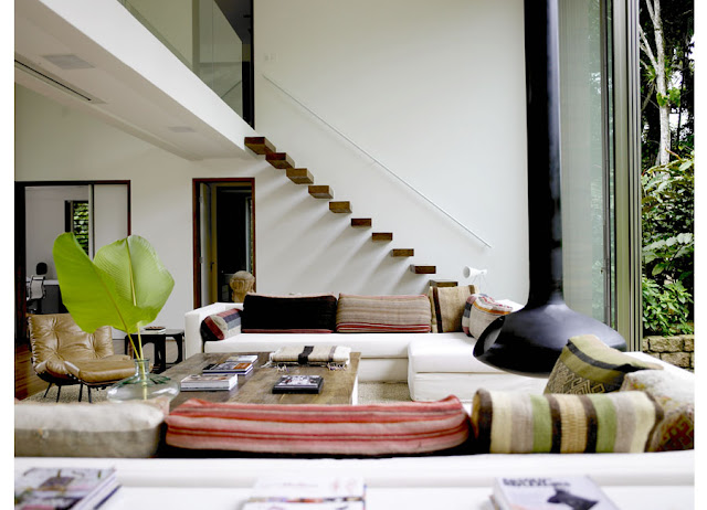
    I love how these thick, chunky wood steps feel light, as if floating in air on this staircase. Visually it's completely stunning, but I have to admit, I could never never have them in my own home - there's something too precarious and nerve wracking about the prospect of climbing them. Just looking at them I feel apprehensive at the thought of tumbling to the ground or worse - somehow getting caught in them. How about you? Is there anything you think is beautiful and would love to try but are secretly terrified of?


    {Photo: Richard Powers}


    Wednesday, October 26, 2011

    A golden harvest

    There's something so welcoming about coming home on a dark, dreary day to a welcoming glow.  The warmth of gold feels like the perfect antidote for the shorter and cooler days. While admittedly I find most Halloween decor to be a bit (or sometimes alot!) tacky, a simple touch of gold gives an ordinary pumpkin a glamorous new look. They'd look equally beautiful outdoors or in, and even as the perfect autumn centrepiece at the dinner table.


    Get the look easily a quick couple coats of gold spray paint, or take it up a notch and use gold leaf. It's a little trickier but the results are worth the effort.

    Find instructions on How to Gild Pumpkins here


    Tuesday, October 25, 2011

    A bedroom in black, white + gold

    This black, white and gold bedroom from an Elle Deecor concept home in Manhattan drew me in straight away. The simplest black and white palette paired with pale grey walls, kept interesting with lots of interesting layers of texture (like that gorgeous rug!) and little pops of bright colour. I could easily make myself right at home.


    How many favourite things can fit in one image? I instantly fell in love with this tea tray in black, white and gold (above).


    {All photos: by , in a special 
    collaboration with Sacramento Street}

    Monday, October 24, 2011

    Thoughts for the new week 24.10.11 {On harvest}


    So important to remember at times when you feel like progress is slow...


    Friday, October 21, 2011

    Love the Look: Fleet Objects and Allen Company Inc


    Really love this week's finds with Camille from Cambie Design. If you've been reading awhile you'll know I'm a bit obsessed with pretty little ceramic pieces in white. I'm thinking one of those little Pools pieces with the blue interior would look perfect on my nightstand.


    This week I am inspired by two of my favourite shops. I originally discovered the B.C. company Fleet Objects while travelling the east coast of Canada and fell in love. I have used their ceramics and housewares to draw items from the always stylish vintage etsy shop Allen Company Inc. I find both companies to be soft and serene, yet smart.


    {Teal Striped DressHandbagChambray Skirt}


    {Shimmer Taupe DressBaby Pink ShellLiquid Pink Top}


    {Leaf Collar SweaterBirch Wool SkirtWooden Heels}


    Thursday, October 20, 2011

    Current bedroom inspiration: a touch of blue


    Slowly but surely, things have been starting to come together in our house over the past few months and finally I'm getting around to tackling our bedroom. Other than a quick coat of paint and a half hearted attempt to arrange some art it's basically been left untouched since we moved in. I'm ashamed to say that currently one of my nightstands is actually a towering stack of magazines (on my side of the bed, naturally). Pale grey walls and my unending devotion to all white bedding has left my options open with a pretty blank slate, and now I'm wanting to add just a few pops of colour, while still keeping the atmosphere calm and serene.

    Liz Lange's bedroom previously featured in Domino magazine, pretty much has exactly the atmosphere I'm trying to achieve. Bright, fresh and relaxing beauifully accented with rich chocolate brown, a graphic black and white pillow and of course, those little pops of blue throughout.


    {Photos: 1,2 - via DressDesignDecor; 3- Alicia B Designs }


    Wednesday, October 19, 2011

    Wanderlust: Cadiz, Spain


    A little wanderlust-ing on a Wednesday - I've been gazing longingly at Peggy Wong's European Travelogue series and got a little caught up in my own daydreaming. Peggy has an amazing eye for detail and has captured the beautiful scenery in such an intimate way, you feel like you've been invited to take a peek behind hidden corners. Particularly on this rainy afternoon, I'm captivated by her album from Cadiz Spain, you can almost feel the sunshine in these images.


    Monday, October 17, 2011

    White and Woodsy

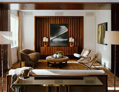
    Perhaps it's the cooler autumn days we've been experiencing over the past week, but lately my mind has been preoccupied with a dozen shades of warm brown (a bit of a departure from my usual black and white). Tan cashmere trenchcoats, cognac leather boots and warm wood tones always seem like the perfect compliment to the crisp carpet of autum leaves.

    This New York townhouse by designers Fox-Nahem feels like the culmination of the warm tones that have been swirling around in my head - rich wood, plush caramel and soft cream give the space an inviting warmth - like coming home to your favourite warm drink on a cold day. The warm tones are balanced with crisp white walls that keep it feeling fresh and sophisticated. To me its like the interior version of a caramel macchiato.


    {Photos: Elizabeth Felicella for Fox- Nahem Associates}


    Thursday, October 13, 2011

    Autumn at the Farnsworth House


    The unbelievably mild weather we've been enjoying has made it impossible not to want to spend every waking minute outdoors. The leaves have burst into a fanfare of bright colour, and as each leave floats softly towards the ground it's become quite apparent that autumn is in full swing. A close substitute to being outside would have to be The Farnworth House in Illinois, designed by Mies van der Rohe in 1945 for a client - Dr Edith Farnsworth, it blends seamlessly with its natural environment. Mies' philosophy on architecture coexisting with nature (below) sums up what this house has so beautifully achieved.


    "Nature should also have a life of its own. We should avoid disturbing it with the excessive color of our houses and our interior furnishings. Indeed, we should strive to bring Nature, houses, and people together into a higher unity. When one looks through the glass walls of the Farnsworth House it takes on a deeper significance than when one stands outside. More of Nature is thus expressed – it becomes part of a greater whole."

    -Mies van der Rohe


    Tuesday, October 11, 2011

    Thoughts for a new week 11.10.11


    Much has already been said on the recent passing of Steve Jobs, on every topic from the enduring legacy of his career to his fashion sense. Many people have been quite critical of this attention, stating that while he was a successful businessman perhaps he is not deserving of the posthumous sainthood that seems to be bestowed upon him. While it may be true that Steve, like all of us, was a mixed bag, I think it's still appropriate to pause and be grateful for the great inspiration that he was. In the face of technical challenges, naysayers, and even disease, Steve always remained undaunted and determined in his pursuits and truly is a testament to the untapped potential that lies within each of us if we only are brave enough to find that passion. 


    {Photo: Pia Jane Bijkerk}

    Friday, October 7, 2011

    {Love the look} Native-Inspired textiles by Cambie Design


    This week's edition is entirely captivated by textiles, particularly Native-inspired prints. Two of the pieces are inspired from traditional Indian American trade blankets from the early 1900s, from the American classic, Pendleton's archives. The other two are ikat prints, an ancient dying technique used to create patterns commonly seen in Latin American and Asian cultures. I am fascinated by textiles and wanted to showcase the dimension that prints can add to your look, while still keeping it neutral.


    {Photos: BlanketSkirtT-ShirtPillow}

    Wednesday, October 5, 2011

    A little glamorous glimpse


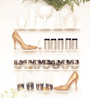
    The Coveteur has quickly become one of my favourite voyeuristic indulgences, their recent feature on Kelly Framel a.k.a. The Glamourai, is one of my favourites thus far, largely due to this image (below). I loved this quirky little display - and what's better? I actually own many of these things already - I have a little brass mouse just like this that sits on my desk (inherited from my grandmother) and some mercury dipped glasses that have been waiting for me at work for some time now. This picture was exactly the incentive I needed to bring those beautiful glasses home at last and give my little mouse a good polish. 


    See the rest of Kelly's glamorous space here.


    {Photos: The Coveteur


    Newer Posts Older Posts Home