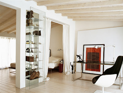
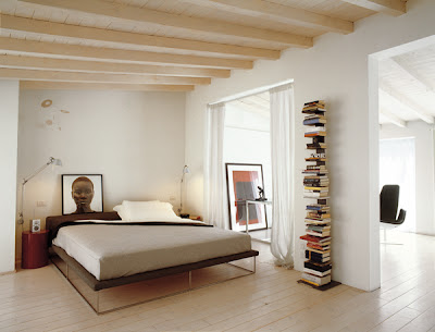
While I've flirted with maximalist tendencies, more often than not in recent times I keep coming back to the notion that simple is best. Often one or two things in a space carry more impact and allow you to appreciate them fully when they're not competing for attention with other objects. Much like a page with one or two statements will force you to contemplate each word and often carry more weight than a whole page full of writing.
The black staircase really creates an anchor juxtaposed with the airy white walls and ceilings. The indoor plants throughout the space give it a sense of tranquility and calm and stop it from looking too sterile or unapproachable.
One of my favourite parts of this space - the large round mirrors. So simple yet a little unconventional in a round shape. Contrasting beautifully with all the straight lines in the space and reflecting the abundance of natural light.
I think my favourite shot (above) love the dramatic contrasts and the glossy black grand piano reflected in the mirror.
{Photos: Giorgio Possetti for Elle Decor Italia, discovered via Aubrey Rd}


5 comments:
i love every simple detail of this modern gem.
lovely, especially that large round mirror u talked about!!
great post :)
www.madebygirl.com
madebygirl.blogspot.com
--
you had me at glossy black grand piano...
barnettcreations.blogspot.com
Jen + Amber - those two elements combined are my favourite part :)
Mel - so glad you loved it too - I've tucked many of these images away in the inspiration files...
What an incredible home.